How strategically collecting and publishing data grabs attention, boosts your brand, and attracts the PR spotlight.

The internet is a crowded place.
Businesses, content marketers and hobbyists are all publishing blog posts, and they’re publishing a lot. Millions of brand new posts are popping up every day. And over the course of a year, the number of new posts reaches well over a billion.
Jump over to Internet Live Stats, and you can literally see the staggering number of content that’s being produced in real time.
WordPress, the most widely used web publishing platform, reports its users publish somewhere around 70 million new posts each month.
It’s obvious that content marketing is no longer an option, but a requirement. The question is, how do you stand out from the crowd? How do you make your content noticeable when new, possibly competing content is published every second?

No matter what your industry is, your voice is just one of many.
You exist in the attention economy, and attention, like oil or water, is a finite resource. Every piece of content that every brand publishes is another attempt to grab some of that attention.
You want backlinks, you want shares, you want mentions in big-name publications. But you’re never going to get any of those things if your content is indistinguishable from the next brand’s.
The best content—the stuff that gets consumed and shared en masse—offers something above and beyond for the reader. It could be a unique insight or previously unknown nugget of information. It could even be a brand new way to visualize a complex topic. Whatever that thing is, it leaves the reader with a fresh perspective and a desire to share what they just read.
One way to get that result is through data-centric content.


Ross Jones
“Perhaps the greatest opportunity with data-focused content is the chance to truly surprise your reader. There’s something exciting about learning an interesting fact.”
Content marketers love data. We use it all the time, from Google Analytics to keyword research to click-through rates. We track followers, likes, mentions and engagement. But something the vast majority of content marketers fail to realize is readers love data too.
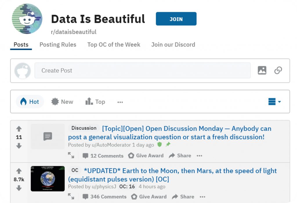
r/dataisbeautiful, Reddit’s subreddit where users post their own data visualizations, is the sites 44th-most subscribed to sub, edging out r/memes, r/Fitness and r/politics. Over 14 million users subscribe to r/dataisbeautiful, where they post their own visualizations like “What percentage of social media content are ads?” and “My income and spending for my first year of adulthood…”
Interest in data-centric content goes far beyond Reddit. In their “LinkedIn Secret Sauce” report, LinkedIn found that content shared on their site had a 37% higher click-through rate when the headline included a statistic.
Why does this happen? Russ Jones, principal data scientist at Moz, elaborates: “Perhaps the greatest opportunity with data-focused content is the chance to truly surprise your reader. There’s something exciting about learning an interesting fact.”

Tim Soulo
“Four out of the top five most-linked articles on Ahrefs Blog are data-centric. These results speak for themselves.”
As it turns out, data can really pull its weight when it comes to grabbing attention and keeping readers engaged. But there’s another powerful effect data has on the way content performs. In an age where facts are harder and harder to come by, data-centric content is a natural attractor of backlinks.
SEO Powersuite conducted a survey of 628 SEOs, who concluded that using data and research was the most efficient way to build backlinks. And Tim Soulo from Ahrefs has first-hand knowledge of just how effective data-centric content is for building backlinks:
“One of the best strategies that worked for [Ahrefs] in terms of building links to our website and growing credibility in our industry is producing data-centric studies. We have a report in Ahrefs called “Best by links” and it ranks all pages of a website by the amount of links they have. Well, four out of the top five most-linked articles on Ahrefs Blog are data-centric. These results speak for themselves.”
That same survey at SEO Powersuite found that while different types of content are good for either building links or getting social media shares, data-centric content consistently performs well in both areas.
Buzzsumo co-founder Steve Rayson analyzed 100 million articles and found that while the majority of content got zero backlinks, articles focused on research and data consistently got more links.
Strategically using relevant data lets your content perform double or triple duty. And the formula is simple: find the data that matters to your audience and present it in a way that interests and engages them. If clicks, shares and links are different fish in the digital ocean, data is the net that catches them all.
So what are some types of data-centric content you can create?
Data-centric content falls into five broad categories: studies, surveys, data dumps, tools, and visualizations. As you’ll see, which type you use depends on the goals of the content piece and what type of dataset you’re using.
Studies and reports have been a staple of newspapers, journals and magazines for decades. They offer a narrative backdrop and reveal the “why” behind a dataset, giving readers something to think and talk about.
Studies and reports work for brands too. Put numbers behind a topic readers love and they’ll do the promoting for you on social media. And if you “own” the data in the study, your brand becomes a source for other pieces of content, leading to backlinks and increased organic reach.
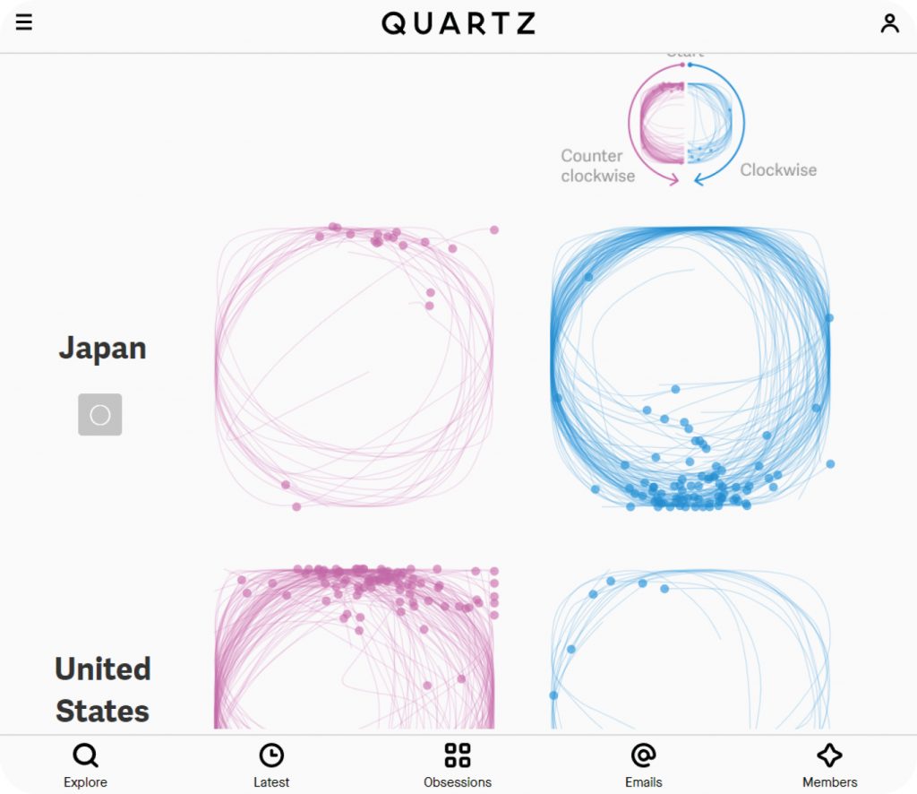
What it is: Quartz says they “go beyond the headlines” to bring fresh perspectives in the global business news space. With this article, they took something as simple as drawing a circle and filtered it through the lens of analyzing national psyches.
Why it works: It’s an example of original research that goes a step further—it collects more data as users interact with it. The elegant design led to success across multiple social media channels, with over 30,000 engagements on Facebook.
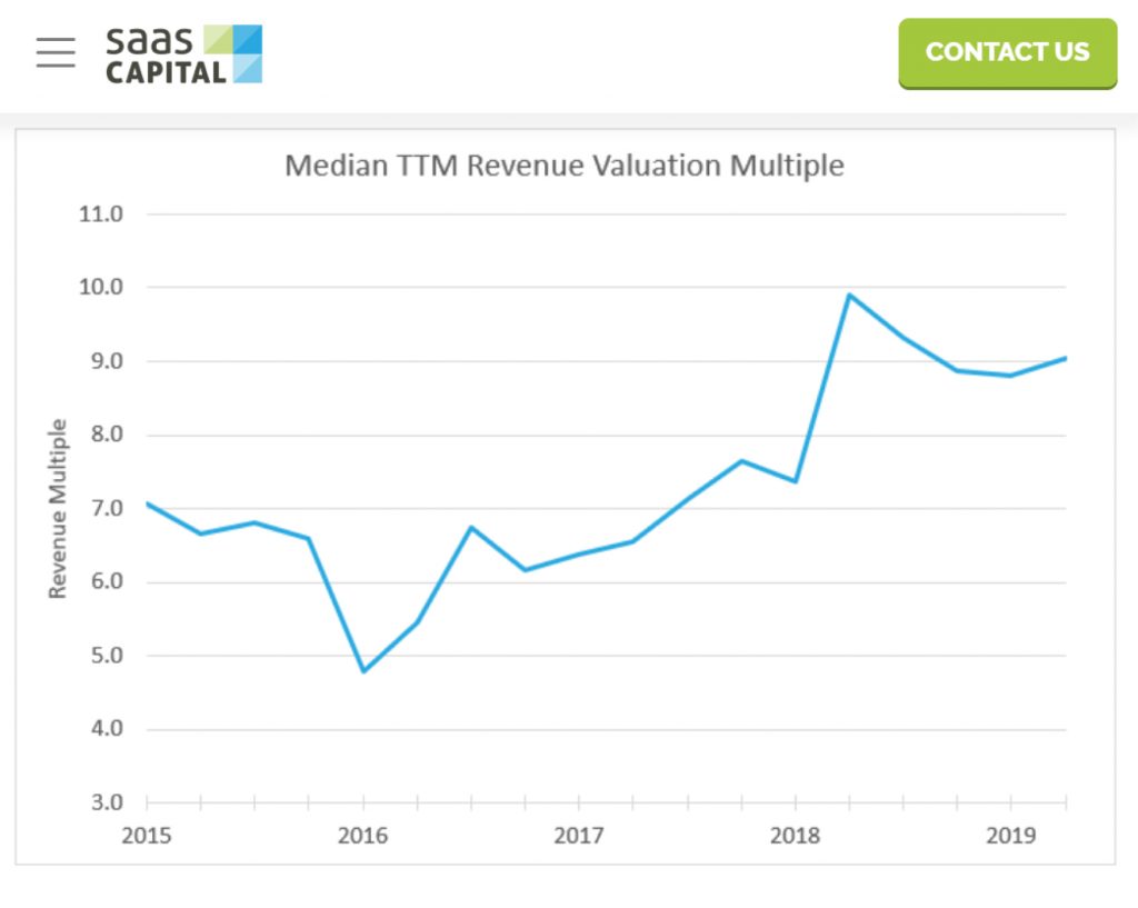
What it is: SaaS Capital found a way to repurpose public data to benefit their readers. By using value metrics from public SaaS companies, they were able to provide readers with a “rule-of-thumb” valuation technique for private SaaS companies.
Why it works: The result of the study was an actionable takeaway for readers. The content was successful, ranking in the top position on Google for “saas valuation.”
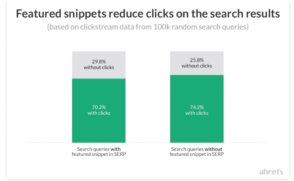
What it is: Ahrefs gives us an example of how powerful doing an original study can be. They analyzed over 2 million featured snippets to create this data-centric resource for anyone looking to up their SEO game.
Why it works: This post shows off the power of original research that it’s highly valued: since it went live, the post has picked up 8,164 backlinks.
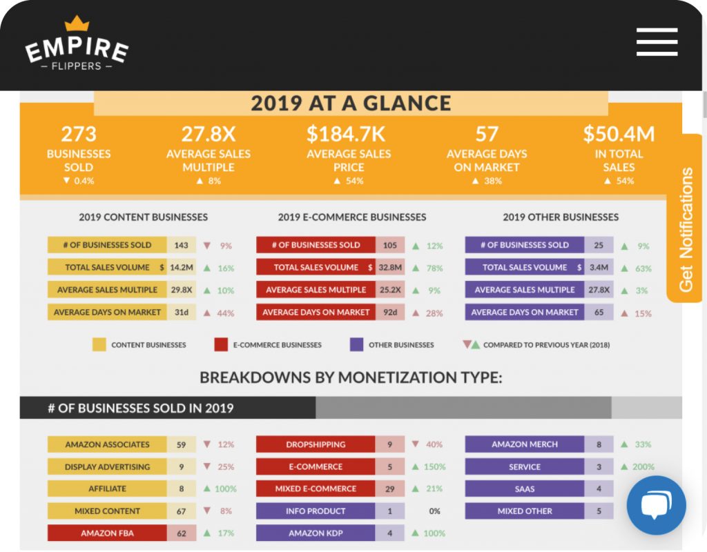
What it is: Greg Elfrink over at Empire Flippers created a compelling example of how reports can be used to create “freemium” downloadable content to capture leads. The post gives just enough info away to entice readers to download the full report.
Why it works:

Greg Elfrink
“When you have good data, you can create more compelling stories and rich content that will, in turn, lead to a bigger audience and thus even larger profit (and hopefully more data). Our State of the Industry Report was the first of its kind and the only of its kind still where we could show the actual sales prices and days on market that it takes for an online business to sell. When you have this kind of data put into an actionable report, you set yourself miles apart from competitors in both your commitment to transparency and as a thought leader in the market.”
What it is: Whotracks.me is the blog for European tech company Cliqz, who develop European alternatives to US-based internet technologies. In this study, they set out to analyze the efficiency of various ad blockers. Their conclusion? The best on the market is Ghostery, which is their proprietary ad blocker.
Why it works: The study succeeds at educating the reader and promoting their product. And self-promotion aside, the article collected 569 backlinks since February, 2019.
Data-driven content doesn’t just work for content marketing. It works for publications too.
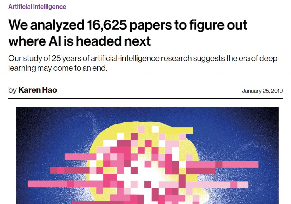
What it is: This article from MIT Technology Review got plenty of attention thanks to its headline. Many fearful clicks want to see where AI is headed. MIT used data to give readers a refreshing look at how AI really works—and its deficiencies.
Why it works: MIT’s article was successful as a valuable reference, earning 746 backlinks from 217 unique domains
One of the key tenets of good content marketing is that it ought to be about the user. It’s a natural instinct for brands to talk about themselves too much in their content. And it even happens in plenty of data-centric content.
Surveys present a great opportunity to take data generated by and collected from readers to create content that is user-centric.
If research and studies aren’t giving you the data you’re looking for, surveys are a powerful tool. Here are some examples of surveys in action:
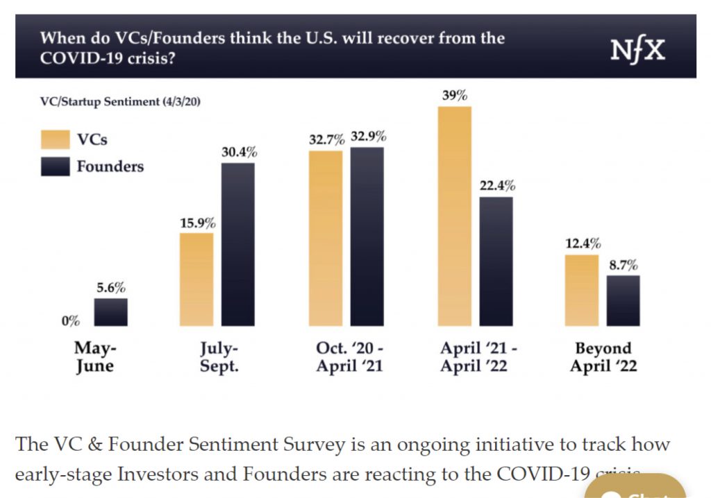
What it is: Venture capital firm NFX created a survey to see how both sides of their industry—founders and investors—are responding to the COVID-19 crisis. To keep readers coming back, they’ve committed to running the survey periodically to capture trends as the crisis unfolds. Finally, they dig up data from the last recession in 2008 to provide some further insight.
Why it works: The ongoing survey from NFX proved to be a valuable resource to the niche, with 121 unique domains linking back to it.
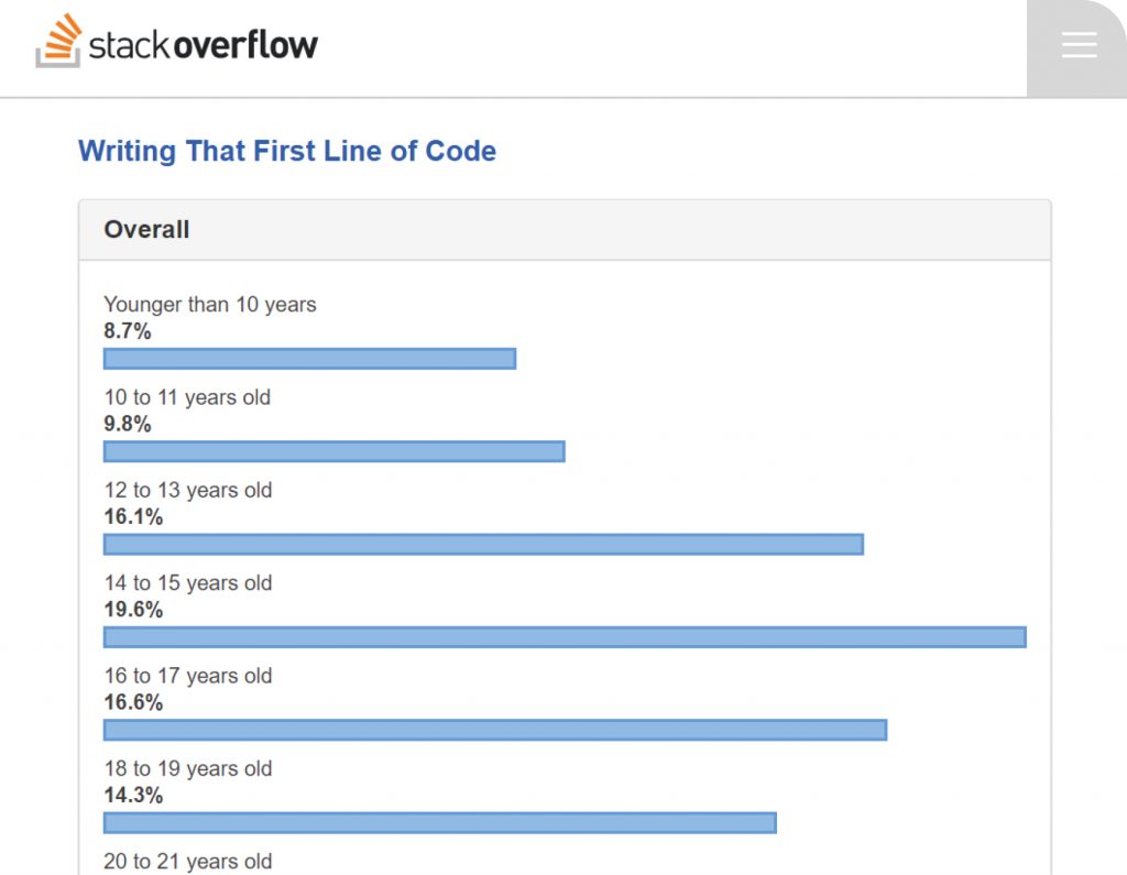
What it is: When you have a large following, surveys can get you some serious data to work with. Stack Overflow sent their survey to over 90,000 users to paint a comprehensive picture of the software development community: how they work, their industry experience, even demographic data.
Why it works: The results were huge. The post gained 15,449 backlinks, 17,300 Facebook engagements and 5,700 Twitter shares.
What it is: Nerdwallet is a personal finance authority site, which gets its success from its high readership and affiliate partners. Google just about any financial question and you’re bound to see one of their posts in the top results.
Why it works: This example shows the results of a survey of over 2000 respondents, which earned them 14,369 backlinks and high ranks for searches around “american credit card debt.”
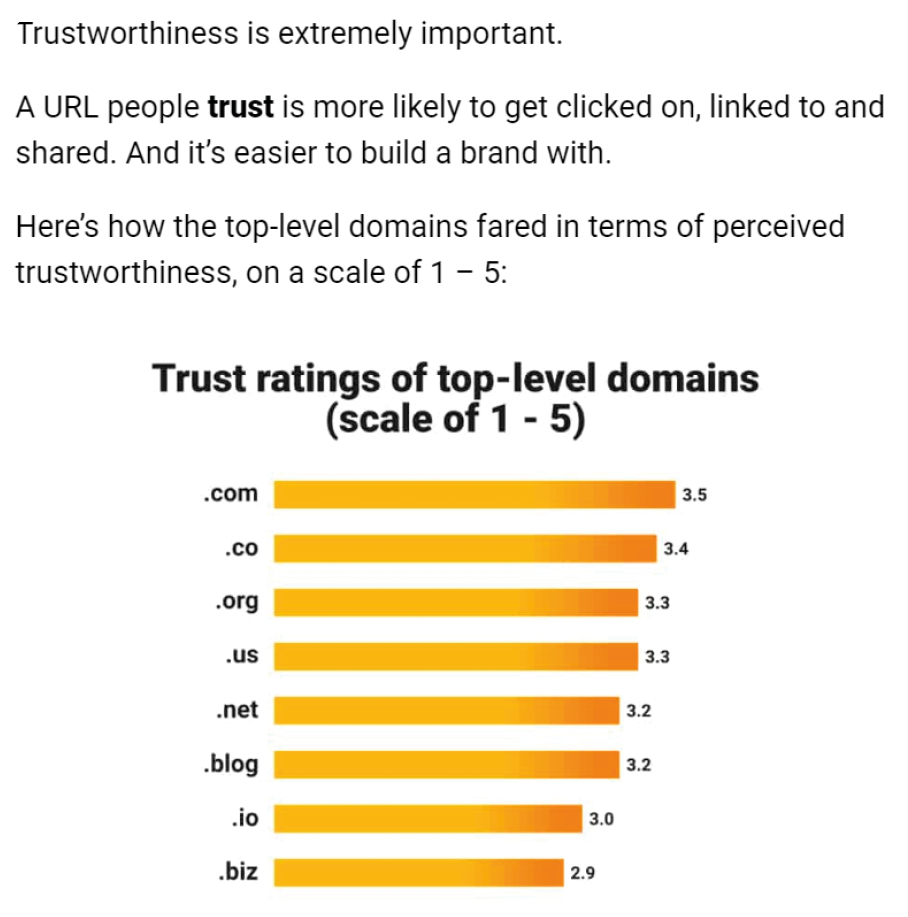
What it is: GrowthBadger found an interesting method for gathering data through surveys. They wanted to learn which domain extensions were the most memorable and trustworthy. Trustworthiness was easy to gather through survey questions, but memorability took a little creativity.
Why it works: To start off, they gave readers a simple task—rank a domain with a random extension for trustworthiness. They followed that up with a series of questions meant to distract readers and gather some demographic data points. Finally, respondents were asked to recall the domain extension given in the first question.

Kyle Byers
Exploding Topics &
GrowthBadger
“I LOVE data-centric content. Need more backlinks? Want to prove your expertise? Want to make a contribution that gets people talking? There’s no better way.”
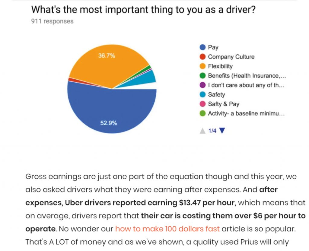
What it is: In another example of ingenuity through surveys, check out the Rideshare Guy. The survey not only gathered vital data, but asked open-ended questions leading to candid responses to accompany the numbers in the article. Going beyond graphs and pie-charts adds a more human element to the article.
Why it works:

“We leverage our audience of 60,000 Uber and Lyft drivers to do an annual survey on the state of the industry and driver sentiment and recently did a topical survey on driver reaction to Coronavirus that garnered over 20 link backs and mentions. Even though we surveyed just 200 drivers, the results were powerful enough and timely enough to be featured in sites like Bloomberg, Campbell CNBC and Fast Company.”

You don’t always need to come to some sort of groundbreaking conclusion in your data-centric content. Sometimes, it’s enough to present a lot of data and let your readers digest it in their own way. That’s what data dumps are for. Data dumps are especially useful if you are collecting data points from multiple sources. It provides value to the reader, giving them access to lots of information in a single place. And it invites opportunities for backlinks.
What it is: Throwing 75+ stats at your readers runs the risk of giving them a case of information overload. In this example, Help Scout presented the information beautifully, breaking the report into chapters, using eye-catching but minimalist graphics and even offering a downloadable PDF to capture email addresses.
Why it works: The article and PDF became valued resources in the industry, with 2,228 referring domains and 5,397 backlinks.
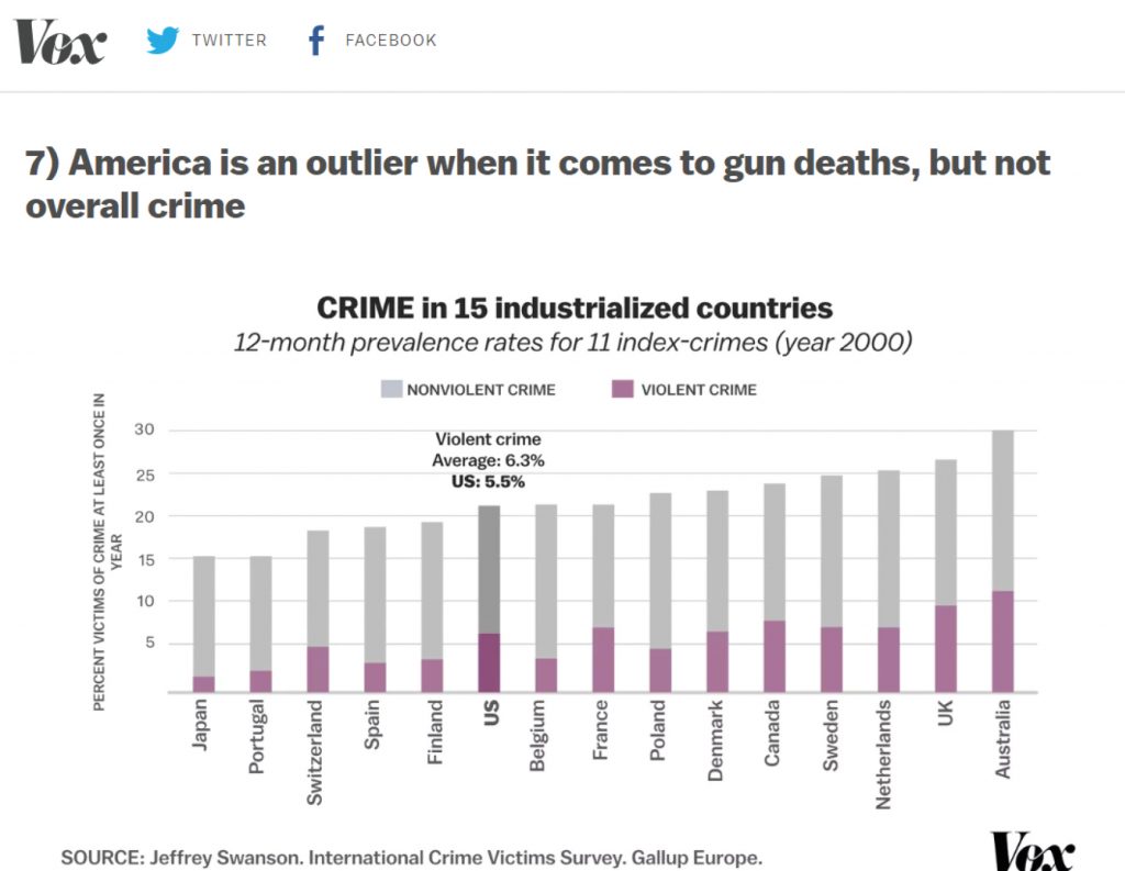
What it is: Vox uses data from multiple sources to paint a complete picture of an idea or issue, in this case “guns in America.” They explore multiple areas of the issue, from frequency of events, to public opinion on policy, to frequency by location.
Why it works: The data allows them to educate readers on the subject while also revealing just how complicated the subject is. Best of all, they use both written and video content to display their results. It was a highly engaging piece of content that lit up social media.
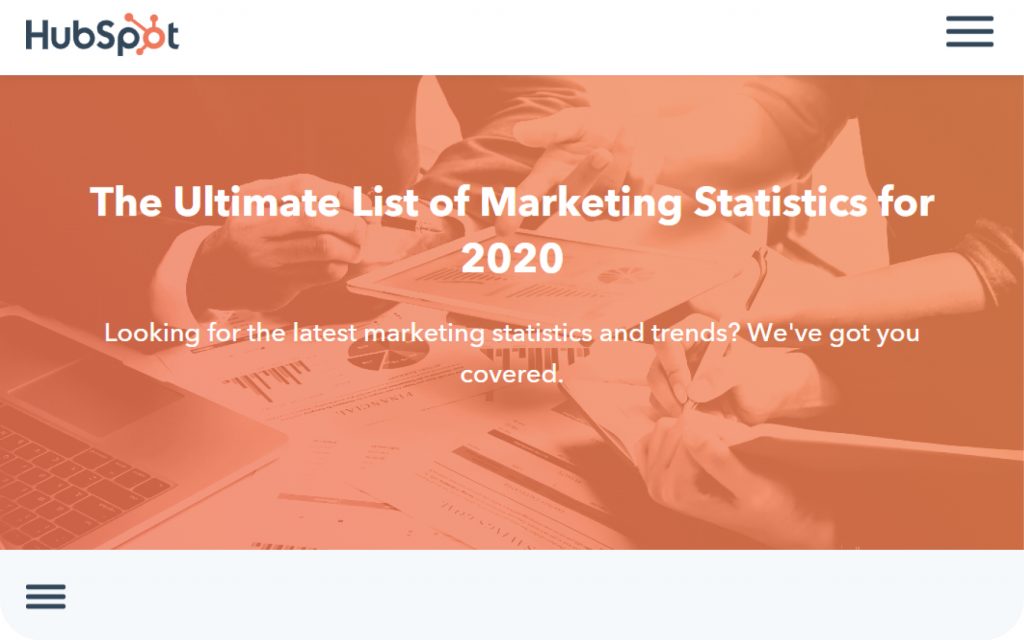
What it is: Hubspot is a name-brand in the digital marketing space, so it’s no surprise they get it right when it comes to data-centric content. In this data dump they cover all areas of digital marketing, making the article appealing to marketers no matter what platforms or channels they use.
Why it works: From this post alone Hubspot picked up a jaw-dropping 46,000 backlinks.
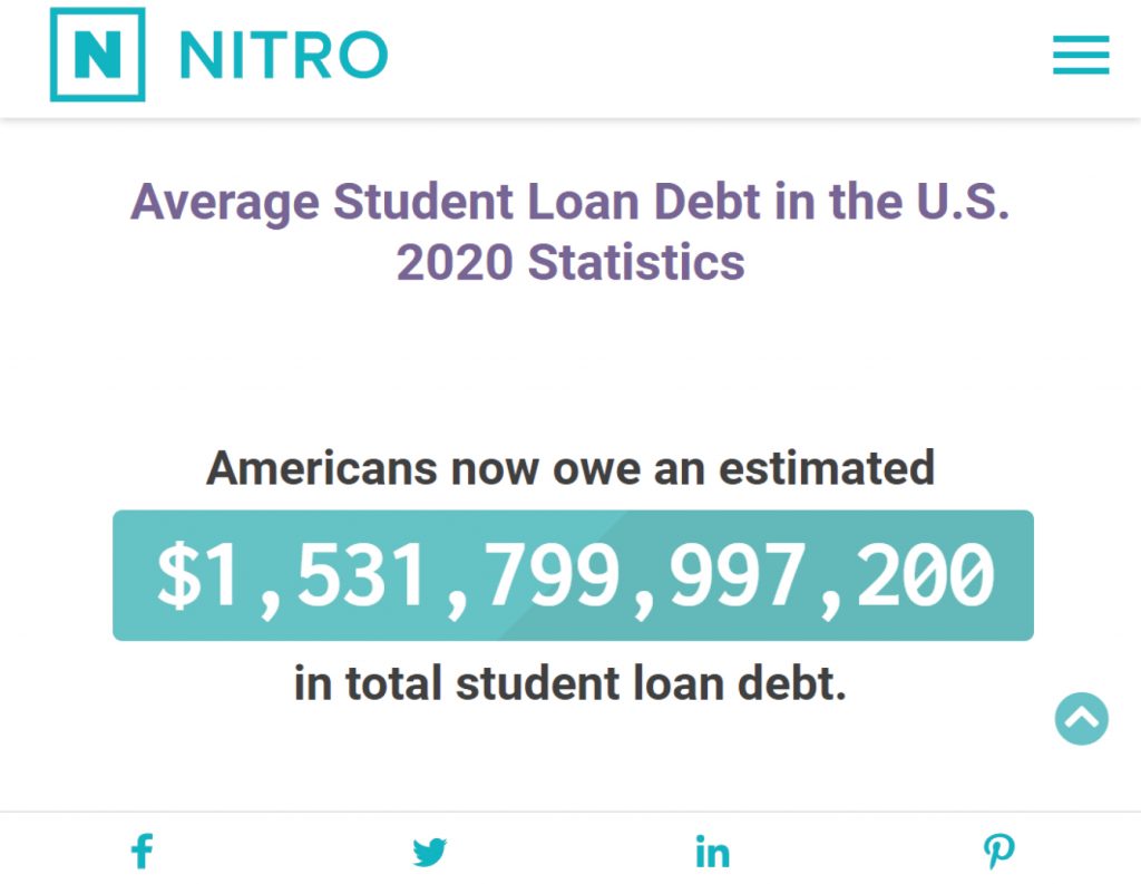
What it is: Even if all your data’s from outside sources, you can still make an impact with a good data dump. Nitro did just that with their student loan article.
Why it works: The data dump immediately hits readers over the head with a real-time estimate of the total amount of American student loan debt. As readers scroll down they’re presented with data point after data point, all from different sources, all stunningly visualized.
A creative way to give your readers value is to allow them to input data and give them back insightful results. With calculators and tools, you provide your users with helpful solutions and give them new perspectives.

What it is: It’s the dream of millions around the world to make boatloads of money from YouTube. As Influencer Marketing’s YouTube calculator illustrates, it’s probably a pipedream for most. The calculator lets users input some YouTube metrics to give them an projected earnings estimate.
Why it works: While the harsh reality presented by the article was surely disappointing to readers, this post has seen a huge amount of organic traffic—63,379 monthly visits.

What it is: It’s a big question on the minds of many Americans: “Who should I vote for?” I Side With takes the calculator idea and lets users input data on dozens of political stances. The results are a very personalized portrait of a users’ political leanings.
Why it works: Politics is an evergreen topic that’s on everyone’s mind. The format is so successful that it’s been used by millions of people (the website puts this user total front and center).
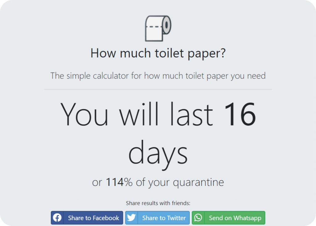
What it is: Part of a content marketer’s job is to stay on top of trending topics. This calculator wasn’t created by markers, but by two friends—Ben Sassoon and Sam Harris—who were curious about how long their toilet paper would last during the COVID-19 pandemic. The calculation uses scientific variables like number of rolls and frequency of bathroom visits.
Why it works: It was interesting enough to win the two pals plenty of media attention, including Jimmy Fallon and the New York Post.

What it is: Detailed decided to put a unique spin on the calculator idea. They created a directory of the top 50 cryptocurrency blogs that updates itself in real time based on the number of backlink mentions each site gets.
Why it works:

“People have certain points that they want to make, and real-world data is something that’s easy to link to and reference to help them make that point.
It helps cover a line of defence – why they actually believe something – and it also means they don’t have to describe that “thing” in a ton of detail.”
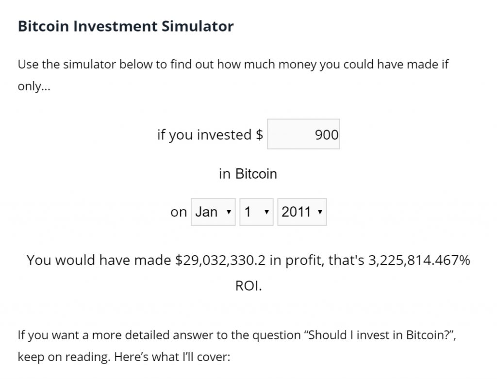
What it is: Remember when Bitcoin was all you ever heard about? This calculator is there to remind you just how rich you’d be today if you’d hopped on the Bitcoin train when it was still in the station. It also gets you interested in reading the rest of the article, which is there to entice the reader into giving up their email address.
Why it works: By leaving the leading question—”Is Bitcoin a safe investment?”— largely unanswered, it presents the user with a juicy 7 Day Bitcoin Crash Course lead magnet.
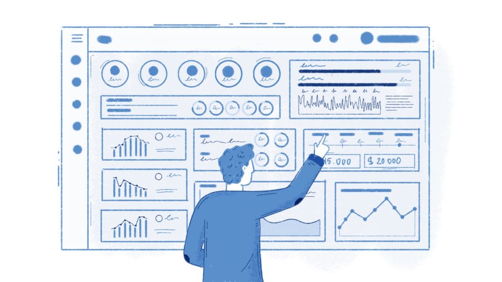
Perhaps the ultimate manifestation of data-centric content is the dashboard. Interactive and highly visual, dashboards allow users to fully immerse themselves in a topic by tweaking variables and watching the results change before their eyes.
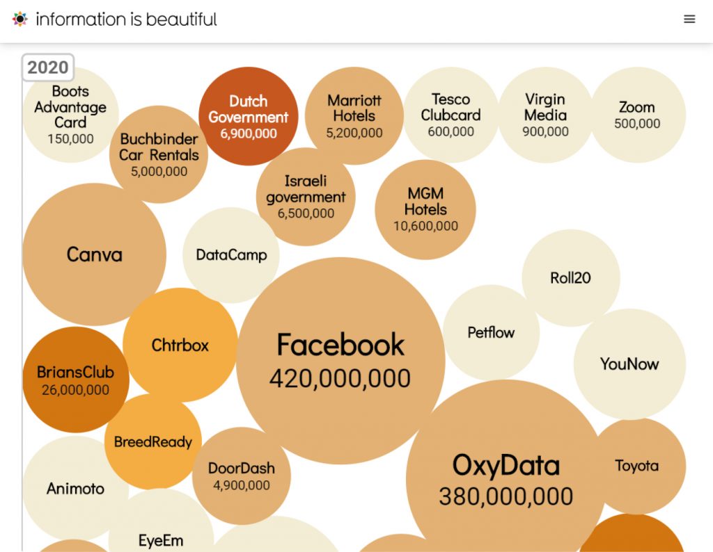
What it is: Big data breaches have made some jarring headlines over the years, but with a 24-7 news cycle they’re mostly forgotten when the next big scandal hits. The folks over at Information Is Beautiful have created a stark visualization of just how many breaches there have actually been in the past decade. The dashboard allows users to filter results by industry and by the specific type of breach.
Why it works: Data visualized in a stylish way tends to get killer results. In this example, the page earned 13,312 backlinks and 2,600 Facebook engagements.
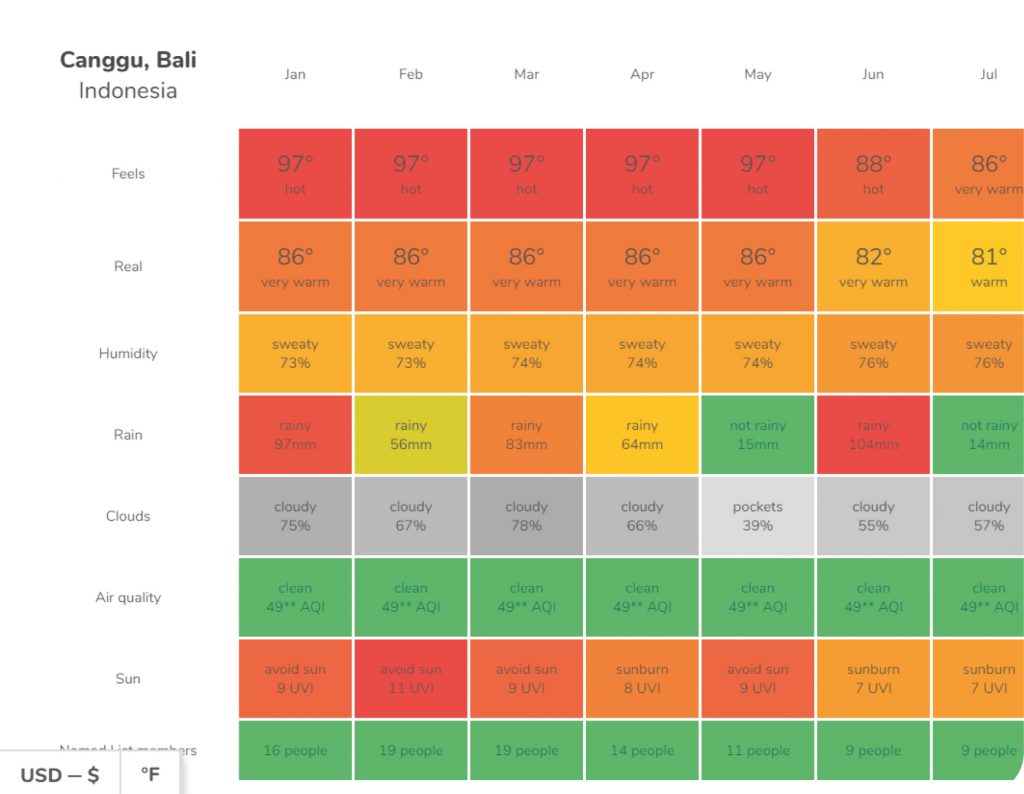
What it is: As more and more work becomes remote, the digital nomad lifestyle is becoming an attainable dream for millions of people. But when you make a living on your laptop and the world is literally your oyster, the natural next question is “where do I go?”
Why it works: Nomad List recognized this need in the market and responded by creating this impressive dashboard. Input the time of year you want to travel and your desired temperature ranges, and you’ll be presented with a list of possible digital nomad destinations.
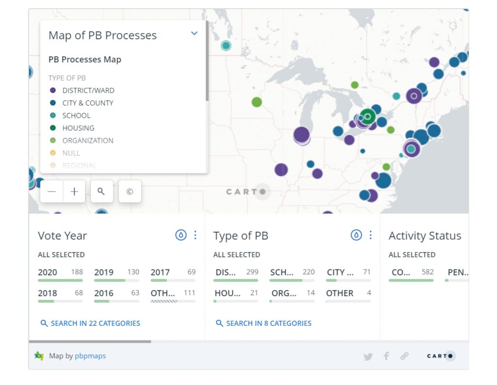
What it is: Participatory budgeting is a system that allows local populations to vote on the allocation of public funds. Participatory budgeting might not be a household term right now, but the movement is picking up steam.
Why it works: This dashboard shows the spread of participatory budgeting across the United States and Canada since 2016. Users are given several variable categories to tinker with, from years to type of budgeting (local, state, school, etc.).
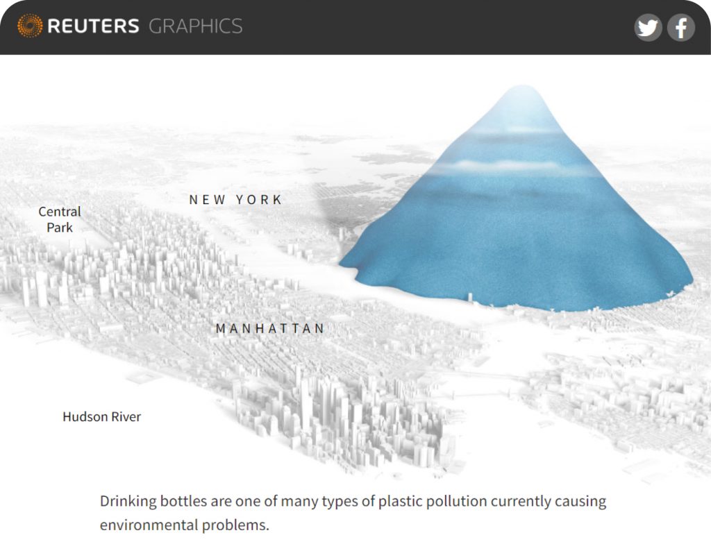
What it is: Environmental concerns are a tricky thing. We know that our plastic use poses serious risks to the environment, but it’s really hard to wrap our heads around just how huge this impact is.
Why it works: Reuters decided to take the data around plastic use and visualize it a way that leaves a serious lasting impression on readers.

What it is: Dashboards can also be used to simplify information that’s too dense to look through otherwise. In this example, Codex Atlanticus takes the vast collection of Leonardo Da Vinci’s works and breaks it down with an elegant design.
Why it works: Da Vinci’s catalogue is massive. Codex Atlanticus has managed to make navigating this collection easy, and with each layer of filters the user selects, the collection shrinks before their eyes. In this case, their design netted them 2,043 backlinks.

Peep Laja
“Anyone can write a blog post, that’s easy. It’s way hard to produce original research. Most bloggers are looking for data to back up their claims. If you can be the source for that data, you get so many backlinks. I know because our original UX research studies are very successful for us.”
Research, surveys and studies don’t just add data to your story, they tell a story of their own. Think about your own content marketing efforts. You’re probably already using data to inform your marketing strategy. Are you also using data to give your readers value?
There are five types of data-centric content you can create:
1. Studies & Reports build a story and narrative around a particular dataset.
2. Surveys empower your readers by making their voice a part of your content.
3. Data Dumps turn your content into valuable resources for others to cite and share.
4. Calculators & Tools help your readers by performing complex equations with the click of a button.
5. Dashboards & Visualizations turn your data into interactive learning machines for your readers.
All of these templates can be used to make your content do more—more for your business and more for your readers. If you start using data in a way that works for your readers, you’ll see results across all channels.
Looking for creative ways to use your data (and get more attention)?
Get in touch with us and get your free content ideas. We’ll find a way to turn your data into an unforgettable story.
Arthur Brodskiy
Arthur Brodskiy is a copywriter and SEO content strategist. He’s written for brands like Square, Mindvalley, and Target Marketing Digital, and he spends his spare time as an actor believing he’s immortal. Connect with him at TheMarketingDollar.com.
We’re a collection of writers and data scientists, that are obsessed with creating and spreading quality, data-driven information. To us, talking about data, analyzing and visualizing it, and turning it into content is the most interesting job in the world.
[email protected]
will reply in 24h